Sindhu Kothuri

Hello, I’m Sindhu 👋🏻

I’m a Software Engineer and Data Analyst who builds data-driven applications, analytics platforms, and dashboards that turn complex data into clear, actionable insights.

I work across Python, SQL, React, and Tableau to engineer scalable systems, automate analytics workflows, and support business decision-making on AWS and GCP.

I take ownership end-to-end — from understanding requirements and designing clean architectures to delivering reliable, intuitive tools that teams can trust and scale with confidence.
Projects

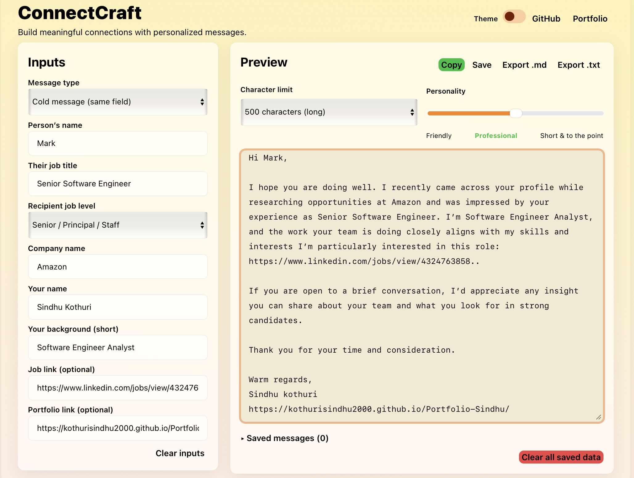
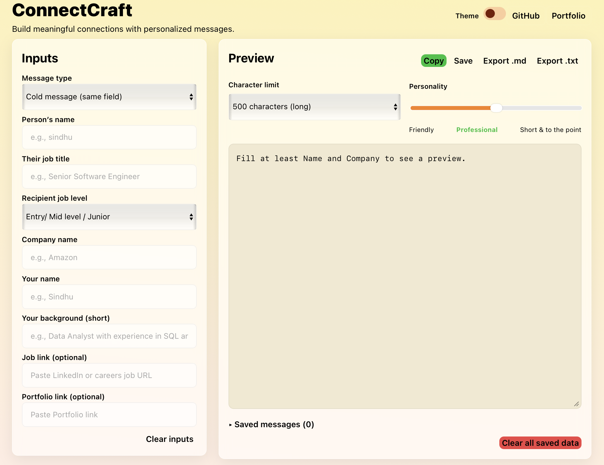
ConnectCraft: Personalized LinkedIn Message Generator

Live Demo

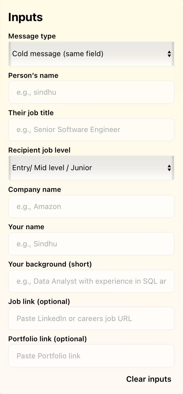
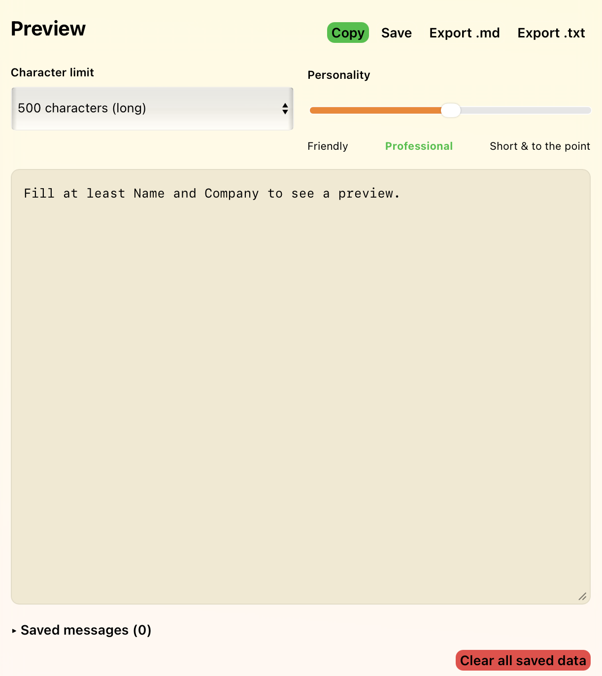
React + TypeScript web app that generates personalized LinkedIn messages with tone control, character limits, and real time previews to improve outreach efficiency and authenticity.

  • Designed and built a React + TypeScript application to automate LinkedIn outreach messaging.
  • Reduced manual message drafting time by 70% using tone-based templates and live previews.
  • Implemented reusable UI components and deployed via GitHub Pages for public access.
ConnectCraft Interface 1 ConnectCraft Interface 2 ConnectCraft Interface 3 ConnectCraft Interface 4

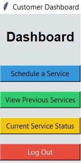
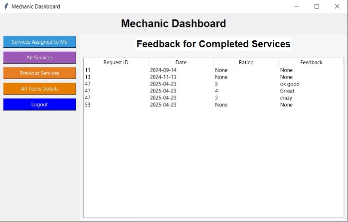
Vehicle Service & Inventory Management – Web Application

Desktop application to streamline vehicle service operations and parts inventory tracking.

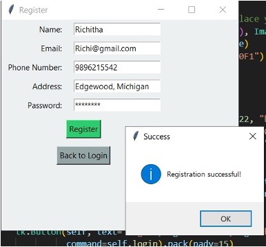
  • Developed a role-based web application for managing vehicle service workflows and inventory.
  • Automated service scheduling, technician assignment, and job status tracking.
  • Built inventory monitoring with low-stock alerts to prevent service delays.
  • Validated system reliability through manual and regression testing.
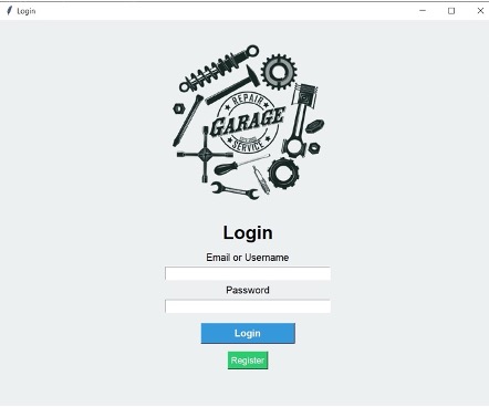
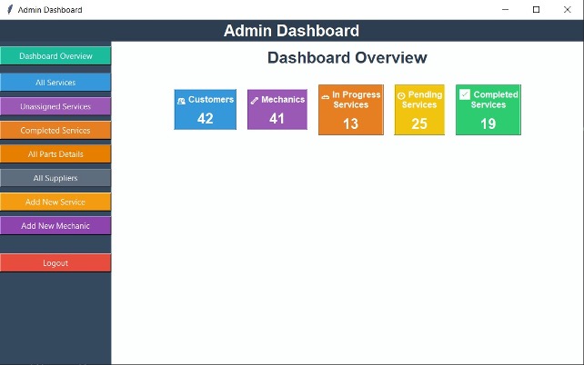
Vehicle service dashboard 1 Vehicle service dashboard 2 Vehicle service dashboard 3 Vehicle service workflow Inventory management screen

Data Analytics Projects

Housing Affordability & Buyer Leverage Analysis – CMU Tableau Competition

Housing affordability dashboard
  • Analyzed state-level US housing data (2024–2025) including affordability, inventory, and market tightness.
  • Built Tableau dashboards with heatmaps, US maps, and comparative bar charts.
  • Delivered insights to support homebuyer decision-making and real-estate strategy.

Tata Data Visualisation Forage - Global Sales & Revenue Insights 2011

Tata Retail Sales Tableau Dashboard
  • Analyzed global sales data for 2011 to track monthly revenue trends, top countries, and high-value customers.
  • Built Tableau visualizations including time-series trends, top 10 country and customer analysis, and a geographic demand map.
  • Enabled stakeholders to identify seasonality, key markets, and top revenue-driving customers for annual planning.

South Asia Inequality & Poverty Analysis – CMU Team Project

South Asia inequality dashboard
  • Integrated socio-economic indicators including Gini index, GNI, life expectancy, and poverty rate.
  • Built Tableau dashboards with KPIs, maps, scatterplots, and trend analysis.
  • Highlighted regional disparities to support policy and resource planning.

Airbnb Housing Analysis - CMU Team Project

Airbnb housing dashboard
  • Analyzed 40K+ Airbnb NYC listings to evaluate pricing and demand patterns.
  • Built Tableau visualizations for neighborhood-level and time-based trends.
  • Identified Manhattan and Brooklyn entire homes as top revenue opportunities.

New Year Health Resolutions by Age Group – CMU Project

Health resolutions dashboard
  • Analyzed survey data across age groups from 18–24 to 65+.
  • Visualized resolution trends, social media usage, and lifestyle priorities.
  • Supported targeted wellness and behavioral campaigns.

Quantium Chips Category Review – Data Analytics Case Study - Forage

  • Analyzed 100K+ retail transactions to segment customers into 18 groups driving 55% of revenue.
  • Calculated KPIs including sales uplift, purchase frequency, and brand loyalty.
  • Validated a projected 15–20% sales uplift using control store matching with 93% correlation accuracy.

Additional Learning & Workshops

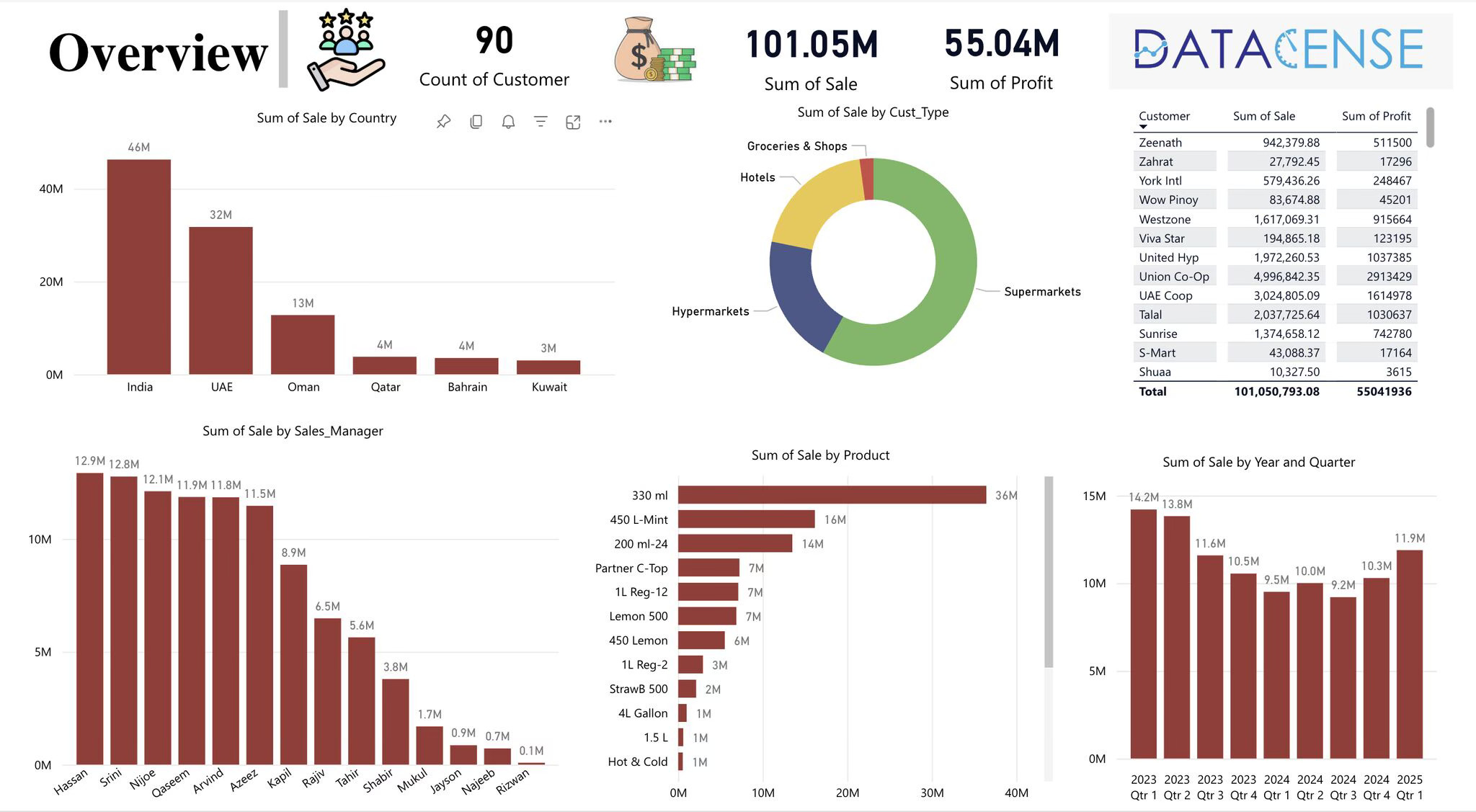
Power BI Hands on Workshop — Datacense

Power BI

Gained practical experience in building interactive dashboards and understanding Power BI’s core capabilities.

Key learnings

  • Data integration and preparation using Excel datasets.
  • Advanced visualization and storytelling techniques.
  • Interactive dashboard design with dynamic filters.
  • Real time data refresh and publishing.
  • Collaboration and secure sharing across teams.
Power BI Workshop dashboard

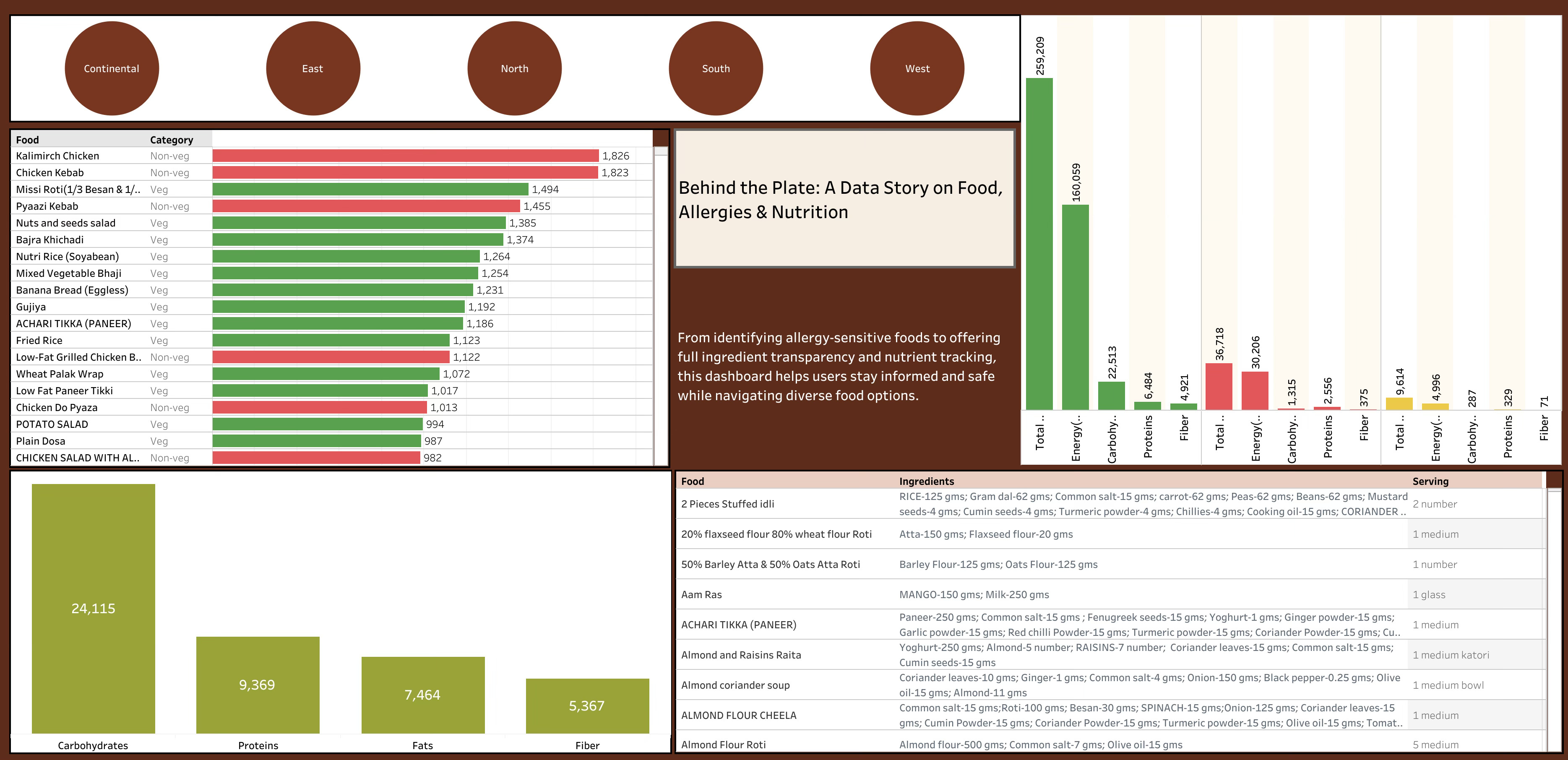
Health Awareness & Nutrition Intelligence Dashboard – Data School Workshop

Tableau

Developed an interactive Tableau dashboard to analyze nutrition and food allergy data, enabling users to assess dietary options and track key nutritional metrics.

  • Designed visualizations for macronutrient breakdowns (carbs, proteins, fats, fiber, energy).
  • Compared vegetarian vs non vegetarian food categories.
  • Integrated ingredient level transparency and allergen tracking.
  • Transformed raw datasets into actionable insights and KPIs.
  • Promoted healthcare awareness through data driven storytelling.
Healthcare Tableau dashboard

Get in touch